
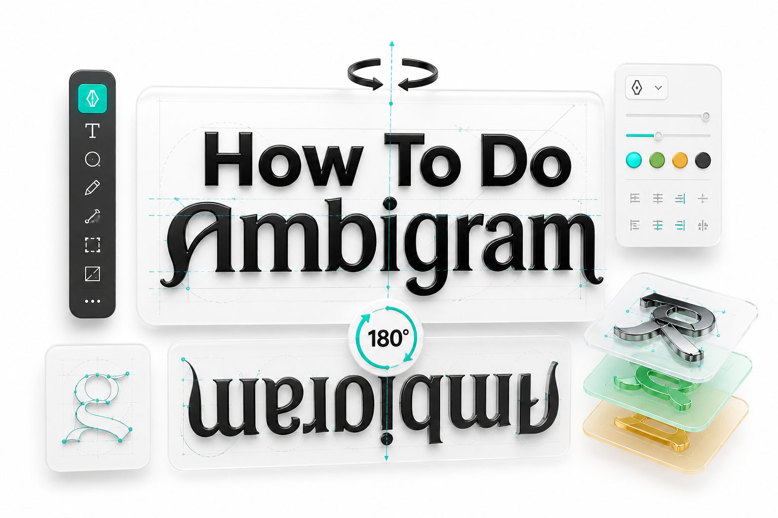
Ambigrams have a way of stopping people mid-scroll or mid-page. A word that still reads correctly after being rotated, mirrored, or viewed from another angle feels almost like a visual trick, but the best ones are built through careful lettering decisions. If you want to learn how to do ambigram art, the process starts with seeing letters as shapes instead of fixed characters.
The good news is that you do not need to be a professional calligrapher to begin. You need patience, a pencil, and a willingness to redraw letters until they cooperate. Ambigram design sits between typography, illustration, and puzzle-making, which is why it appeals to artists, logo designers, tattoo lovers, and anyone who enjoys clever visual language. This guide breaks the process into practical steps so you can create a readable, balanced ambigram from scratch.
What an Ambigram Really Is
An ambigram is a word or phrase designed to be readable from more than one viewpoint. The most common type is rotational, where the word reads the same after being turned 180 degrees. Other versions use mirror symmetry, figure-ground tricks, or different words from different angles.
The key is not simply flipping normal letters. Most typed fonts fail immediately because letters are too rigid. Ambigram lettering requires custom shapes, adjusted proportions, and smart compromises so each mark can represent one letter in one direction and another letter after transformation.
Why Ambigrams Work Visually
Ambigrams work because the brain is flexible when reading familiar words. We do not inspect every stroke equally; we recognize patterns, openings, stems, curves, and spacing. A designer can use that flexibility to make one shape suggest two different letters.
This is why readability matters more than perfect letter accuracy. A successful ambigram gives the reader enough clues to solve the word quickly. If the design is too abstract, it becomes decoration rather than lettering, and the visual puzzle loses its impact.
Key Features of a Strong Ambigram
- Clear readability from both intended directions
- Balanced spacing between letters
- Consistent stroke weight and visual style
- Letter pairs that share similar shapes
- Decorative details that support, not hide, the word
- A design style suited to the final use, such as a logo, tattoo, poster, or monogram
Choosing the Right Word
The easiest way to learn how to do ambigram work is to start with a short word. Four to six letters is ideal because there are fewer transformations to solve. Words with repeated letters, balanced shapes, or natural symmetry are usually easier for beginners.
Names, values, and short brand words are popular choices. Words like love, hope, faith, dream, or mirror can work well, depending on the style. Avoid long phrases at first because every added letter increases the number of visual problems you must solve.
Checking Letter Pair Compatibility
For rotational ambigrams, letters pair from opposite ends of the word. The first letter must transform into the last, the second into the second-to-last, and so on. In a five-letter word, the center letter must usually rotate into itself or remain visually acceptable.
Some pairings are easier than others. Letters like n and u, b and q, d and p, m and w, and s and s naturally offer useful relationships. Harder pairings may still work, but they often require more stylized lettering and stronger decorative control.
Beginner Word Selection Checklist
- Choose a word with 4 to 6 letters
- Write the word in lowercase first
- Pair letters from outside to inside
- Mark easy pairings before solving hard ones
- Avoid words with too many rigid vertical letters
- Test whether the center letter can rotate cleanly
- Pick a word with personal or visual meaning
Planning the Ambigram Structure
Before sketching decorative letters, decide what type of ambigram you are making. A rotational ambigram needs a central axis and must read after a half-turn. A mirror ambigram needs vertical or horizontal reflection. Each type changes how you build the letters.
Most beginners should start with a 180-degree rotational ambigram. It is the most recognizable style and gives you clear rules. Write the word normally, then write it upside down beneath itself. This simple comparison shows which letter pairs need to merge.
Setting a Visual Style
Your style controls how much flexibility you have. Blackletter, gothic, script, graffiti, and ornamental lettering can hide transitions well because they already use dramatic strokes. Clean sans-serif ambigrams are harder because every unusual shape becomes obvious.
Choose a style that supports your skill level and purpose. For practice, a slightly decorative serif or calligraphy-inspired style works well. It gives you room to bend terminals, extend curves, and add flourishes without making the word look messy or forced.
Lettering Styles Compared
Style | Best For | Difficulty | Notes
Gothic | Tattoos, posters, dramatic words | Medium | Strong vertical strokes help disguise transformations
Script | Names, romantic words, elegant designs | Medium | Connecting strokes can solve awkward gaps
Sans-serif | Logos, modern marks | Hard | Requires very clean shape logic
Graffiti | Bold art, streetwear, expressive words | Medium | Flexible forms allow creative solutions
Serif | Classic logos, print-inspired art | Beginner-friendly | Small details help letters transform naturally
Sketching the First Draft
Start by drawing a light baseline and writing the word in loose letters. Leave more space than usual between characters because you may need to widen, stretch, or connect them later. Do not aim for beauty in the first pass.
Next, rotate the page and look at the word upside down. Write the same word again if needed, then compare each pair. Circle areas where shapes nearly match. These near matches are your starting points because they need less correction.
Building Letter Pairs
Work on one pair at a time instead of trying to solve the full word immediately. If the first letter must become the last letter, sketch several hybrid shapes until both readings become possible. Keep rotating the page after every adjustment.
A good letter pair usually keeps one or two recognizable features from each letter. For example, an h may become an e if its vertical stem is curved and its shoulder becomes an open counter. The solution depends on suggestion, not exact duplication.
Practical Sketching Tips
- Use tracing paper to test variations quickly
- Rotate the page often while drawing
- Work in pencil before using ink
- Keep early drafts loose and ugly
- Redraw the full word after solving each pair
- Check readability from a few feet away
- Ask someone to read it before explaining it
Using Symmetry Without Making It Stiff
Symmetry is useful, but too much symmetry can make an ambigram look mechanical. Real lettering needs rhythm, contrast, and spacing. If every letter is forced into the same width, the word may become technically clever but visually uncomfortable.
Allow small optical corrections. A curve may need to be thicker on one side, or a letter may need extra space to breathe. These adjustments help the ambigram feel intentional rather than trapped inside a geometric rule.
Managing Stroke Weight
Stroke weight is one of the biggest reasons beginner ambigrams fail. If one transformed letter is thin and another is heavy, the word feels inconsistent. Decide early whether your design uses monoline strokes, calligraphic contrast, or bold block shapes.
Once you choose a weight system, apply it across every letter pair. Thick strokes should appear in predictable places. Thin connectors should feel intentional. This consistency helps readers accept unusual letterforms because the whole design looks like one alphabet.
Common Mistakes to Avoid
- Starting with a long phrase too early
- Using a standard font without redrawing letters
- Adding decoration before solving readability
- Making every letter the same width
- Ignoring spacing between transformed letters
- Using flourishes that confuse the reading direction
- Inking the first sketch before testing it upside down
Refining Readability
After the rough structure works, focus on readability. Look at the ambigram at different sizes. A design that works large may fail when reduced, especially if small gaps or decorative strokes are doing too much of the reading work.
Try showing the sketch to someone without context. If they can read it in both directions after a short pause, the design is close. If they struggle too long, simplify the most confusing letters rather than adding more ornament.
Balancing Beauty and Function
An ambigram must work as lettering before it works as art. Decoration should make the design more attractive while protecting the letter logic. Swashes, spikes, shadows, and extensions are useful only when they guide the eye instead of distracting it.
This balance is especially important for tattoos and logos. A tattoo must age well on skin, and a logo must reproduce cleanly at different sizes. Keep the final use in mind before committing to tiny details or fragile linework.
Quick Readability Test
- Read the word normally
- Rotate it 180 degrees
- Read it again without tilting your head
- Shrink the design to thumbnail size
- View it from across the room
- Check if the first and last letters are clear
- Remove any detail that causes confusion
Using Digital Tools
You can create an ambigram fully by hand, but digital tools make refinement easier. Drawing apps let you duplicate, rotate, flip, and adjust sketches without starting over. Vector software is especially useful when preparing final artwork for print or branding.
Popular options include Procreate, Adobe Illustrator, Affinity Designer, Inkscape, and even basic tablet sketching apps. The tool matters less than the workflow. Start loose, solve the letterforms, then clean the curves once the design already reads correctly.
Turning a Sketch Into Clean Artwork
Scan or photograph your best sketch and place it into your design software. Lower the opacity, then trace over it on a new layer. Use smooth curves, consistent stroke widths, and clean joins while preserving the character of the handmade draft.
Avoid over-polishing the artwork until it feels lifeless. Ambigrams often benefit from a slight human irregularity. The goal is controlled lettering, not sterile geometry. For more help with polishing letterforms, see [Internal Link: Lettering Design Basics].
Suggested Tools for Ambigram Design
Tool | Best Use | Skill Level
Pencil and paper | Early sketching and idea testing | Beginner
Tracing paper | Comparing rotations and overlays | Beginner
Procreate | Hand lettering on a tablet | Beginner to advanced
Illustrator | Vector logos and professional files | Intermediate
Inkscape | Free vector editing | Intermediate
Affinity Designer | Affordable vector refinement | Intermediate
Adding Style and Personality
Once the ambigram reads well, you can shape its personality. A word like strength may suit heavy, angular lettering. A name for a wedding design may call for flowing script. The visual tone should match the meaning of the word.
Style decisions include stroke contrast, terminals, texture, outlines, shadows, and spacing. Add these gradually. If a flourish weakens readability, either revise it or remove it. Strong ambigram design always protects the word before showing off the ornament.
Working With Negative Space
Negative space can solve difficult letter pairs. The empty area inside or around a stroke may suggest a missing counter, crossbar, or curve. This technique is useful when two letters do not share much obvious structure.
For example, a dark stroke might form one letter while the white space beside it completes another. This approach takes practice because readers must still see the intended word naturally. Use it carefully and test the result often.
Style Enhancement Tips
- Match the lettering mood to the word meaning
- Add flourishes only after readability works
- Use negative space for difficult letter pairs
- Keep decorative strokes consistent across the word
- Avoid tiny details for tattoos or small logos
- Create a plain version before adding effects
- Save multiple versions during refinement
Practicing With Simple Letter Pairs
Letter pair practice is the fastest way to improve. Instead of designing full words every time, draw pairs like a-e, m-w, b-q, d-p, n-u, and r-a. These exercises train your eye to see letters as flexible shapes.
Create a small library of pair solutions. Over time, you will notice repeatable patterns, such as curved stems, shared bowls, disguised crossbars, and mirrored terminals. This library becomes a useful reference when designing longer or more complex ambigrams.
Trying Names and Custom Words
Names are popular, but they are not always easy. A name may contain awkward letter pairings, repeated vertical strokes, or center letters that resist rotation. Start by mapping the pairs before promising that a name will work cleanly.
If one letter pair is difficult, consider changing the style rather than forcing a poor shape. Script, gothic, or decorative serif styles can often solve pairings that look impossible in plain print. You can also use initials for a cleaner result.
Good Practice Words
- love
- hope
- dream
- faith
- magic
- angel
- level
- noon
- mirror
- grace
- honor
- bloom
Preparing an Ambigram for a Tattoo
Tattoo ambigrams need extra care because skin changes over time. Fine lines can blur, tight gaps can close, and tiny decorative details may lose clarity. A bold, readable design usually ages better than a delicate one with fragile strokes.
Print the design at actual tattoo size before final approval. If any letter becomes unclear on paper, it will likely be worse on skin. Talk with a tattoo artist about line thickness, placement, and how the design will sit on the body.
Preparing an Ambigram for a Logo
A logo ambigram must be more than clever. It needs to function on websites, packaging, social icons, invoices, and signage. That means the design should work in one color, at small sizes, and without relying on texture or shadows.
Create a simplified version first, then add secondary treatments if needed. Test it on light and dark backgrounds. For brand-focused lettering principles, see [Internal Link: Custom Logo Lettering]. A readable mark will serve the business better than a complicated visual trick.
Tattoo Versus Logo Considerations
Use Case | Main Priority | Best Approach
Tattoo | Longevity on skin | Bold lines, open spacing, limited detail
Logo | Versatility | Clean vector shapes, strong silhouette
Poster | Visual drama | More ornament, texture, and scale
Monogram | Compact recognition | Simple letter pairing and symmetry
Gift art | Personal meaning | Decorative style with readable names
Finalizing the Design
When the design reads well and matches the intended style, create a final clean version. Ink it by hand or trace it digitally. Keep the curves deliberate, clean up uneven spacing, and remove marks that do not support the finished word.
Make several final exports if you are working digitally. A high-resolution image works for sharing, while a vector file is better for printing, cutting, engraving, or logo use. Keep the original layered file so future edits remain possible.
Improving Through Iteration
Ambigram design rarely works perfectly on the first attempt. The best results come from redrawing, rotating, testing, and simplifying. Each pass should make the word easier to read and more visually balanced, not merely more decorative.
Save early drafts instead of erasing everything. A rejected version may contain one strong letter solution you can reuse later. This habit also helps you see progress, which matters because ambigram lettering often improves through small, patient adjustments.
Final Review Checklist
- The word reads from both intended views
- Letter spacing feels even
- Stroke weight is consistent
- Decorative details do not block readability
- The design works at small and large sizes
- The final style matches the word’s purpose
- File formats suit print, web, tattoo, or branding use
Conclusion
Learning how to do ambigram design is part lettering practice and part visual problem-solving. The process begins with choosing a manageable word, mapping the letter pairs, and sketching flexible shapes that can carry more than one reading. From there, readability, spacing, stroke weight, and style turn a clever idea into polished artwork.
The strongest ambigrams are not the most complicated ones. They are the designs that feel natural in both directions while still having character. Start with short words, rotate your page often, and test every version before adding decoration. As your eye improves, you will begin to spot hidden relationships between letters more quickly. With steady practice, ambigram creation becomes less mysterious and more like a repeatable design method: sketch, compare, revise, simplify, and refine until the word finally clicks.
FAQ
Can beginners make an ambigram?
Yes, beginners can make an ambigram by starting with short words and simple letter pairs. Pencil sketches, tracing paper, and frequent rotation make the process easier. The first goal should be readability, not perfect decoration.
What is the easiest ambigram type to learn?
A 180-degree rotational ambigram is usually the easiest starting point. It has clear rules and common letter pair patterns. Beginners can rotate the page while sketching to see whether each shape still reads correctly.
Do I need special software for ambigram design?
No, you can design an ambigram with pencil and paper. Digital tools help with tracing, rotating, and refining, but they are not required. Many strong ambigrams begin as rough hand sketches.
Which words work best for ambigrams?
Short words with flexible letters usually work best. Words with natural pairings such as n and u, m and w, or b and q are easier. Names can work too, but some need heavy stylization.
How long does it take to create an ambigram?
A simple ambigram may take under an hour, while a polished custom design can take several hours or more. The time depends on word length, letter difficulty, style, and final use.
0 Comments