
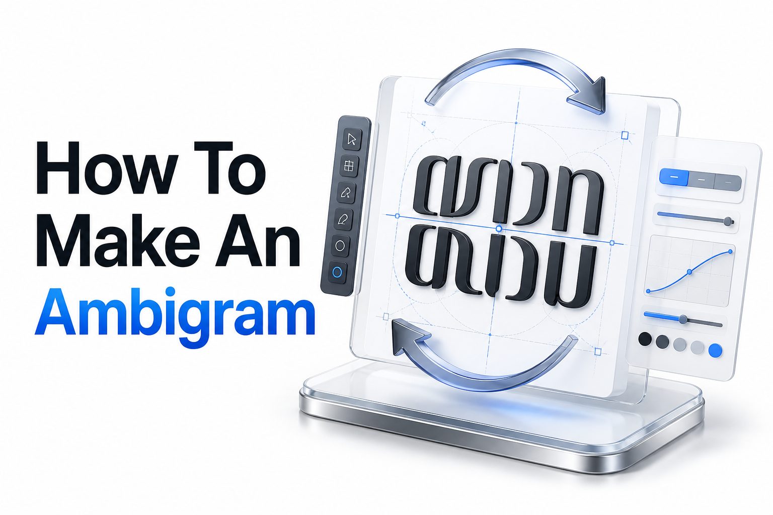
Ambigrams have a strange kind of magic. A word looks normal from one direction, then turns, flips, or mirrors into the same word or a different one. That visual surprise is what makes them popular for logos, tattoos, book covers, puzzles, and custom lettering projects.
If you want to learn how to make an ambigram, the process is less mysterious than it first appears. You do not need to be a master calligrapher, but you do need patience, a good eye for letter shapes, and a willingness to sketch rough ideas before refining the final design.
The best ambigrams are not random tricks. They balance readability, symmetry, style, and meaning. A strong design should still feel like intentional lettering, not a word forced into an awkward shape. This article walks through the process from choosing a word to polishing the final artwork.
What an Ambigram Really Is
An ambigram is a typographic design that can be read in more than one way. The most common version reads the same after being rotated 180 degrees, but other types use mirrors, reflections, or visual substitutions to create a second reading.
The appeal comes from controlled ambiguity. Each letter is shaped so it performs two jobs at once. A lowercase “n” may become a “u,” an “m” may become a “w,” and an “s” may stay readable from both directions with only minor adjustment.
Why Ambigrams Are Harder Than Normal Lettering
Standard lettering focuses on beauty, spacing, and readability from one fixed angle. Ambigram lettering has to solve those same problems while also working from another viewpoint. That means every curve, stroke, and gap carries extra responsibility.
The challenge is not only artistic. It is also structural. You are building a visual system where letters share forms, swap identities, or reflect each other. Good ambigrams often feel effortless, but they usually come from many rounds of testing and revision.
Key Features of a Strong Ambigram
- Clear reading from both intended directions
- Consistent lettering style across the full word
- Balanced spacing between characters
- Smart use of symmetry and negative space
- Minimal distortion of important letters
- A style that fits the word’s purpose
- Enough simplicity to stay readable at smaller sizes
Choose the Right Word First
Some words are naturally easier to turn into ambigrams because their letters pair well when rotated or mirrored. Words with letters like o, s, x, n, u, m, w, and z often provide more flexibility than words filled with difficult shapes.
Start with a short word if you are new to ambigram design. Three to six letters is usually manageable. Longer words can work, but they introduce more spacing issues, more letter pairings, and more chances for the design to lose clarity.
Study Letter Pairings Before Sketching
Before drawing a polished version, write the word normally and upside down. Look at which letters land opposite each other. In a rotational ambigram, the first letter pairs with the last, the second pairs with the second-to-last, and so on.
This step helps you spot easy matches and difficult conflicts. For example, “m” and “w” are natural partners, while “r” and “k” may require more creative shaping. The earlier you identify problem pairs, the smoother the design process becomes.
Beginner Ambigram Word Checklist
- Pick a word with 3 to 6 letters
- Avoid too many rigid uppercase letters
- Look for natural rotation pairs
- Test the word upside down early
- Choose a style before refining details
- Keep the first version simple
- Check readability before decoration
Select the Best Ambigram Style
Rotational ambigrams are the most popular because they create a satisfying upside-down reading. They are ideal for tattoos, posters, and logos where the viewer can physically rotate the design or mentally flip the word.
Mirror ambigrams work through reflection, often across a vertical or horizontal axis. These are useful for marks, symbols, and decorative lettering. They can be striking, but they depend heavily on symmetry and may limit the natural personality of the letters.
Use Lowercase and Custom Letterforms
Lowercase letters are often easier to manipulate because they have softer shapes, ascenders, descenders, and flexible curves. A lowercase “h” can sometimes become a “y,” while “e” and “a” can share similar circular structures with the right styling.
You are not limited to standard alphabet forms. Ambigram design often requires custom letterforms that borrow traits from two letters at once. The goal is not to draw textbook letters, but to create readable shapes that satisfy both readings.
Rotational and Mirror Ambigram Comparison
Type | Best For | Main Challenge
Rotational ambigram | Tattoos, logos, posters, word art | Making letters readable upside down
Mirror ambigram | Symbols, monograms, decorative marks | Maintaining symmetry without stiffness
Chain ambigram | Patterns, borders, ornaments | Keeping repetition clean
Figure-ground ambigram | Advanced art pieces | Using negative space clearly
Symbiotic ambigram | Two different words | Balancing meaning and readability
Sketch Rough Shapes Without Judging Too Early
The first sketches will usually look awkward. That is normal. Start by drawing loose versions of each letter pair instead of trying to complete the whole word perfectly. Work on one pair at a time and rotate the page often.
Use pencil or a digital sketching app with layers. Keep your strokes light and flexible. At this stage, you are searching for possible forms, not making final artwork. A messy sketch can hold the idea that later becomes a clean design.
Build Around the Hardest Letter Pair
Every ambigram has at least one difficult pairing. Instead of avoiding it, solve it early. If one letter combination refuses to cooperate, the entire word may need a different style, case choice, or structural approach.
Once the hardest pair works, easier letters can be adapted around it. This method prevents wasted time polishing a design that fails at the center. It also helps establish the visual language for the rest of the word.
Simple Sketching Process
1. Write the word normally in lowercase.
2. Write it upside down beneath the first version.
3. Mark each letter pair.
4. Sketch each pair as a shared shape.
5. Rotate the page after every few marks.
6. Combine the pairs into a full word.
7. Remove details that hurt readability.
8. Redraw the cleanest version several times.
Pay Attention to Negative Space
Negative space is the empty area inside and around letters. In ambigrams, it can be just as important as the strokes themselves. A small gap may help a shape read as an “e” from one angle and an “a” from another.
Many beginner designs fail because the strokes become too heavy or crowded. Leave breathing room between letters and within loops. If the viewer has to work too hard to separate the forms, the effect becomes frustrating instead of clever.
Keep the Style Consistent
Even when letters are doing different jobs, they should feel like they belong to the same alphabet. Stroke width, curve style, terminals, slant, and spacing should follow a clear pattern across the whole design.
Choose a style that supports the word. A sharp gothic look may suit a dramatic name, while a rounded script may suit a romantic phrase. Style is not decoration added at the end; it is part of the structure from the beginning.
Common Design Mistakes to Avoid
- Starting with a word that is too long
- Using heavy decoration before the letters work
- Ignoring spacing between difficult letter pairs
- Making one reading clear and the other unreadable
- Mixing too many lettering styles
- Depending on color to solve weak shapes
- Forgetting to test the design upside down
- Tracing fonts without adapting the forms
Use Grids and Guidelines Carefully
Guidelines help keep your ambigram balanced, especially when working with rotation. A center line, baseline, cap height, and x-height can prevent the design from drifting as you refine the letterforms.
Do not let the grid make the lettering stiff. Ambigrams often need optical correction, where something looks balanced even if it is not mathematically perfect. Trust your eye as much as the ruler, especially with curves and diagonals.
Refine Readability Before Adding Detail
Once the rough structure works, redraw the ambigram with cleaner strokes. Remove extra loops, unnecessary flourishes, and confusing overlaps. A simple readable ambigram is stronger than an ornate one that only the designer can decode.
Test the design with someone who has not seen your sketches. Ask them what they read from each direction. If they hesitate too long, note where the confusion happens and simplify that area before moving to final styling.
Useful Tools for Making Ambigrams
- Pencil, eraser, and tracing paper
- Grid paper for alignment
- Procreate, Adobe Fresco, or similar sketching apps
- Adobe Illustrator, Affinity Designer, or Inkscape for vector work
- Font references for lettering inspiration
- A mirror or rotation tool for quick testing
- Printed drafts for checking distance readability
Turn the Sketch Into Clean Artwork
After the sketch reads well, move to a clean version. You can ink it by hand or trace it digitally. Vector software is useful because you can adjust curves, align strokes, and scale the artwork without losing quality.
Focus on smooth curves and intentional stroke endings. Uneven lines can make the design look unfinished, even if the idea is strong. For logos, tattoos, or print use, a vector file is usually the most practical final format.
Test the Ambigram in Real Use
A design that works on a large screen may fail when printed small. Test your ambigram at different sizes and from different distances. If it is for a tattoo, check how it looks on curved skin rather than only on a flat page.
Also test contrast. Black lettering on white paper is the clearest starting point. Once the structure is proven, you can experiment with color, texture, or shading. Effects should support the form, not hide weak letter construction.
Practical Readability Tests
- Rotate the design 180 degrees and read it again
- Print it at small, medium, and large sizes
- Show it to someone without giving hints
- View it from across the room
- Convert it to black and white
- Check whether every letter has enough space
- Remove decorative details and see if it still works
How to Make an Ambigram Logo
Ambigram logos need more restraint than personal art pieces. A logo must remain readable across business cards, websites, packaging, signs, and social media icons. That means the letterforms should be clever but not overly complicated.
For brand work, start with the name and personality of the business. A law firm, coffee brand, tattoo studio, and music label all need different visual tones. For more branding ideas, see [Internal Link: logo design tips] before finalizing your concept.
How to Make an Ambigram Tattoo
Ambigram tattoos are popular because they carry hidden meaning and personal symbolism. Names, paired words, and short phrases are common choices. Still, tattoo designs must be especially clear because skin texture and aging can soften fine details.
Avoid extremely thin lines, tight gaps, and tiny interior spaces. Ask the tattoo artist whether the design will hold up at the intended size. A strong tattoo ambigram usually favors bold structure over delicate complexity.
Best Practices for Tattoos and Logos
- Keep the word short when possible
- Use bold shapes for long-term clarity
- Avoid tiny gaps that may close over time
- Test the design at the final size
- Choose a style that fits the meaning
- Ask a professional before permanent use
- Save a clean black-and-white version
Use Fonts as References, Not Shortcuts
Fonts can help you study rhythm, stroke weight, and decorative possibilities. However, typing a word in a font and flipping it rarely creates a good ambigram. Most letters need custom editing to work from both directions.
Look at blackletter, script, serif, and geometric fonts for inspiration. Notice how letters connect and how curves repeat. Then draw your own forms based on the needs of the word. Originality matters, especially for logos and tattoos.
Try Two-Word Ambigrams
A two-word ambigram reads as one word from one direction and another word after rotation or reflection. These designs are harder because the words must share compatible length, rhythm, and letter shapes.
Good pairings often have similar character counts or visual balance. For example, paired names or opposite concepts can work well when the letters have flexible forms. If the words are very different, you may need a more abstract lettering style.
Helpful Pairing Tips
- Pair words with similar lengths
- Compare first-to-last letter matches
- Avoid words with too many rigid letters
- Use lowercase for more flexibility
- Sketch both readings before choosing a style
- Keep emotional meaning in mind
- Use [Internal Link: typography basics] for stronger letter decisions
Polish Spacing and Stroke Weight
Spacing can make or break an ambigram. Even if each letter pair works alone, the full word may feel uneven when assembled. Pay close attention to gaps between letters, especially around wide forms like “m” and narrow forms like “i.”
Stroke weight should also feel intentional. If one part is much heavier than the rest, it may pull attention away from the reading. Consistent weight helps the viewer accept unusual letterforms as part of one complete design.
Add Decoration Only After the Word Works
Flourishes, shadows, outlines, and textures can add personality, but they should come late in the process. Decoration cannot rescue a weak ambigram. In many cases, extra detail makes the word harder to read.
When adding style, repeat shapes that already exist in the letters. A terminal curve can become a flourish, or a thick downstroke can support a shadow. The best effects feel connected to the lettering rather than pasted on top.
Final Ambigram Review Checklist
- Both readings are clear without explanation
- Letter pairs share a consistent style
- Spacing feels balanced across the word
- The design works in black and white
- Small-size readability has been tested
- Decorative elements do not confuse the letters
- The final file is clean enough for its purpose
- The word still feels natural, not forced
Conclusion
Making a strong ambigram takes patience, but the process becomes easier when you treat it as a lettering puzzle instead of a trick. Start with a short word, study the letter pairs, sketch rough shapes, and solve the hardest combinations before polishing the full design.
The most successful ambigrams balance creativity with readability. They look intentional from both directions, hold together as a single style, and suit the purpose behind the word. Whether you are designing a logo, tattoo, poster, or personal art piece, clear structure matters more than heavy decoration.
If you keep testing, rotating, simplifying, and refining, you will build a sharper eye for what works. That is the real skill behind how to make an ambigram: seeing two possible readings inside one carefully shaped piece of lettering.
FAQ
Can beginners make ambigrams?
Yes, beginners can make ambigrams by starting with short words and simple letter styles. The key is to sketch loosely, rotate the design often, and focus on readability before adding decorative details or advanced effects.
What is the easiest ambigram type to make?
A rotational ambigram is often the easiest place to start because the rules are clear. The word must read after a 180-degree turn, so you can pair letters from opposite ends and solve them one by one.
Do I need drawing skills to create an ambigram?
Basic drawing skills help, but you do not need advanced illustration ability. Ambigram design depends more on observation, patience, and letter testing. Tracing paper, grids, and digital layers can make the process much easier.
Which words work best for ambigrams?
Short words with flexible letters usually work best. Letters like o, s, x, n, u, m, w, and z often rotate or adapt well. Names and paired words can also work if their letter shapes match closely.
Can I use an ambigram for a logo?
Yes, an ambigram can work well as a logo when it stays readable, scalable, and relevant to the brand. Keep the design clean, test it at small sizes, and avoid details that disappear in practical use.
0 Comments