
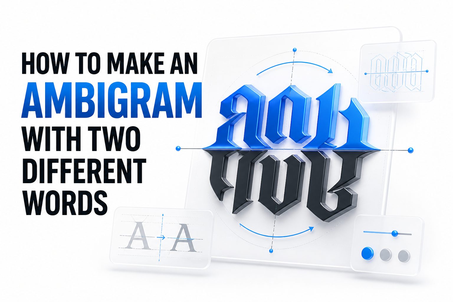
An ambigram turns lettering into a visual puzzle. When it works well, one word transforms into another through rotation, reflection, or a carefully balanced shape system. That is exactly why so many artists, tattoo clients, logo designers, and lettering fans want to learn how to make an ambigram with two different words. It combines typography, symmetry, and problem-solving in a way few lettering styles can match.
The challenge is not simply making two words look decorative. You need to build letterforms that can shift identity without becoming unreadable. That takes planning, patience, and a solid method. If you have ever tried sketching one and felt stuck after the first few letters, that is normal. A two-word ambigram is part design exercise and part visual engineering.
This article breaks the process into practical stages, from picking the right word pair to refining shapes that hold together when flipped or rotated. You will also see common mistakes, layout strategies, and testing methods that help your final design look intentional rather than forced.
What a Two-Word Ambigram Really Means
A two-word ambigram is a lettering design where one word changes into a second word when viewed from another angle or through another form of symmetry. In most cases, the design rotates 180 degrees, but some ambigrams rely on mirror effects or stacked constructions instead.
That distinction matters because not every pair of words can work in every ambigram style. If you want to learn how to make an ambigram with two different words, you first need to know which transformation method gives your chosen words the best chance of becoming legible and visually balanced.
Why Word Choice Matters From the Start
The easiest ambigram projects begin with word pairs that share a similar length, rhythm, or letter structure. Words with repeated vertical strokes, rounded shapes, or convertible letters usually offer more flexibility than words filled with awkward diagonals or highly uneven spacing.
Choosing the wrong pair can turn a promising idea into hours of revisions with little progress. That is why professional lettering artists test the word pair before drawing polished forms. A smart choice at the beginning often saves far more time than any stylistic fix later in the process.
Quick Signs a Word Pair Has Potential
- Similar word lengths often produce cleaner visual balance
- Repeated letters can create useful symmetry anchors
- Rounded letters like O, C, and S often adapt more easily
- Letters such as M, W, N, U, H, I, and O are often easier to convert
- Extremely long words usually need more compression and stylization
The Best Ambigram Types for Two Different Words
Rotational ambigrams are the most common option for two different words. In this format, the design reads one word normally and the second word when rotated upside down. This approach suits logos, tattoos, and social media artwork because it creates a striking reveal with one simple movement.
Mirror ambigrams can also work, especially when the words have strong vertical structure. These designs use reflection rather than rotation, which can simplify certain letters but complicate others. The best type depends on the shapes inside your two words, not on which format looks trendier online.
How to Match the Ambigram Style to the Words
Start by sketching rough letter pairings and testing them in both rotational and mirrored formats. Some pairs fail immediately in one system and begin to make sense in the other. That early test is more useful than committing to a decorative style before the structure works.
If one word is much wider than the other, stacked or asymmetric compositions may help. If both words share a similar character count, a single-line rotational ambigram is usually the strongest choice. The goal is not novelty alone. The goal is readable transformation with controlled design logic.
Simple Style Comparison
Style: Rotational ambigram
Best for: Two different words with comparable length
Main challenge: Letter conversion after 180-degree rotation
Style: Mirror ambigram
Best for: Words with strong vertical symmetry
Main challenge: Keeping both sides readable
Style: Stacked ambigram
Best for: Uneven word lengths or complex pairings
Main challenge: Maintaining balance without clutter
Style: Glyph-based custom ambigram
Best for: Highly stylized branding or tattoos
Main challenge: Risk of losing legibility
How to Map Letters Between the Two Words
The core step in how to make an ambigram with two different words is letter mapping. This means pairing each letter in the first word with the letter it needs to become in the second word. You are not drawing words yet. You are building a transformation blueprint.
For example, if one word has five letters and the other also has five, each position can often map directly. If the lengths differ, one letter may need to absorb two roles, or a flourish may need to help bridge the transition. This is where most strong ambigrams either begin to work or completely fall apart.
How to Build a Letter Pairing Chart
Write the first word left to right, then place the second word beneath it in reverse reading order if you are making a rotational ambigram. That makes it easier to see which letter pairs need to share a common shape. Once paired, sketch minimal skeleton forms rather than full calligraphy.
This chart helps you spot problem letters early. You may notice that one pairing feels natural while another has no visual relationship at all. That does not mean the design is impossible. It simply means some letters will need stylization, merging, or abstraction to carry the illusion.
Common Letter Pair Examples
- O to O is usually straightforward
- M to W often works well in rotational designs
- N to U can be adapted with stroke control
- S to S may work if the curve is simplified
- E to M is difficult and often needs custom shaping
- R to A can work only with strong stylization
How to Start with Basic Skeleton Sketches
Begin with thin, simple line drawings before you add serifs, swashes, or decorative strokes. Skeleton sketches reveal whether the letter structure can actually transform. If the basic frame fails, ornament will only hide the problem temporarily and make later revisions harder.
This stage should feel rough and experimental. Draw several versions of the same letter pairing and rotate the page constantly. Professional ambigram artists often solve a design by testing ten ugly sketches before one useful structure appears. Speed and repetition matter more here than polish.
Why Thin Drafts Work Better Than Final Lettering
Thin sketches force you to focus on proportion, stroke direction, and shared geometry. They also make it easier to erase and rebuild without becoming emotionally attached to one version. That discipline leads to stronger outcomes than trying to create finished artwork on the first pass.
Once the skeleton begins to work, you can build weight, contrast, and personality into the lettering. Until then, keep every form as simple as possible. If you want extra practice with shape planning, our article on ambigram design basics and our guide to hand lettering structure can help.
Useful Sketching Checklist
- Write both words in plain block letters first
- Rotate the page after each draft
- Test one difficult letter pair at a time
- Keep early strokes light and narrow
- Mark which letters read clearly and which ones fail
- Save alternate drafts instead of erasing every attempt
How to Handle Different Word Lengths
Word length mismatch is one of the biggest obstacles in a two-word ambigram. A six-letter word paired with a four-letter word creates spacing and conversion problems that cannot be solved by style alone. You need to distribute visual weight carefully so one side does not feel compressed.
There are several ways to handle this. A single letter can serve double duty, two letters can merge into a shared glyph, or an exit stroke can create the illusion of an additional character. None of these fixes should look accidental. Each one needs to support readability in both directions.
Ways to Compress or Expand Letter Structures
If one word is longer, try condensing narrow letters and widening rounded ones so the overall width feels more equal. Ligatures can also help. Joining two letters into one flowing form often reduces clutter while giving the design a more intentional handwritten quality.
On the other hand, if one word is shorter, extended ascenders, descenders, or swashes can fill empty space. The trick is restraint. Decorative expansion should solve a spacing problem without turning the entire ambigram into an unreadable ornament. Structure must still lead the design.
Important Spacing Fixes
- Use ligatures when two letters naturally connect
- Stretch curves before stretching straight stems
- Fill empty outer edges with controlled flourishes
- Avoid inserting decoration in the middle of hard-to-read letters
- Keep the visual center of both words aligned
How to Use Symmetry Without Making It Stiff
Symmetry gives an ambigram its logic, but too much symmetry can make the design feel mechanical. The best ambigrams use controlled symmetry rather than exact duplication. They preserve the transformation while allowing small variations that improve flow, rhythm, and readability.
This is especially important when the two words are different. If you force every letter into a rigid mirrored system, some characters will become awkward or misleading. Instead, think in terms of visual equivalence. A stroke does not need to match perfectly if it performs the right role after rotation.
Creating Balance Across the Whole Word
Look at the silhouette of the full ambigram, not just individual letters. A balanced top line, steady baseline, and consistent stroke rhythm can make difficult letter conversions feel more natural. Readers often accept unusual shapes when the entire wordmark feels cohesive.
That is why composition matters as much as lettercraft. A slightly imperfect conversion can still succeed inside a strong overall design. But a few excellent letter pairings inside a poorly balanced wordmark will still look broken. Train your eye to judge the whole form first, then refine details.
Visual Balance Tips
- Compare the left and right side weight
- Keep major curves consistent across the word
- Repeat stroke endings for unity
- Avoid one oversized letter dominating the mark
- Check the design as a silhouette from a distance
How to Add Style After the Structure Works
Once your skeleton sketch reads in both directions, you can begin shaping the final style. This is where serif details, brush influence, gothic touches, script movement, or tattoo-inspired linework can enter the design. Style should enhance the illusion, not replace it.
Many beginners decorate too early because the draft looks plain. That usually backfires. A clean ambigram earns its style after the transformation is convincing. If you are still unsure whether a letter reads correctly, wait before adding thickness, texture, or embellishment.
Choosing a Style That Supports Readability
High-contrast scripts can look elegant, but they may hide structural problems if used too soon. Bold blackletter styles can solve some spacing issues, though they also introduce complexity. Sans serif ambigrams are often better for practice because they keep the letter logic exposed.
Whatever style you choose, apply it consistently. If one letter is ornate and the others are plain, the design feels patched together. A professional result comes from repeating visual rules across the full wordmark, even when individual letters need special treatment.
Common Final Style Options
- Minimal monoline for clean readability
- Serif lettering for classic and editorial appeal
- Script forms for fluid tattoos and personal marks
- Blackletter influence for dramatic contrast
- Custom logo lettering for brand use
How to Test Legibility Like a Professional
Testing is the stage that separates an interesting sketch from a usable ambigram. Rotate the design repeatedly, reduce it in size, step away from the page, and ask whether both words can still be identified. If one reading only works after explanation, more refinement is needed.
Professional designers also test ambigrams with fresh eyes. That can mean covering half the page, flipping the sketch quickly, or asking another person what they read first. You are not testing whether the design looks artistic. You are testing whether it actually communicates two intended words.
Practical Legibility Checks
Print or view the design small and large. A design that only works at poster size may fail in a tattoo stencil or logo application. Likewise, a tight ambigram that reads on paper may blur on screen if the inner counters and stroke gaps are too narrow.
Try tracing over your own draft on a new sheet. This often reveals where the structure is carrying too much visual baggage. If a letter only works because of surrounding decoration, the redesign should happen now rather than after final rendering or client approval.
Legibility Checklist
- Rotate the page every few minutes
- View the design at thumbnail size
- Test in black and white only
- Ask another person for a first read
- Check whether the second word appears naturally
- Redraw weak letters instead of defending them
Common Mistakes That Weaken Two-Word Ambigrams
One common mistake is choosing style before structure. Another is assuming every letter must transform cleanly on its own. In reality, some letters depend on neighboring forms to complete the illusion. That is acceptable, but only if the full word remains readable and balanced.
A second mistake is overdecorating problem areas. Swashes, shadows, and dramatic serifs can distract from poor letter mapping, but they rarely fix it. The strongest ambigrams usually feel simpler than expected because they solve conversion problems with shape logic, not visual noise.
How to Avoid Forced Letter Pairings
If a letter pairing refuses to work after many drafts, reconsider the structure of the word pair itself. You may need a different ambigram type, a different casing approach, or a more stylized interpretation. Good ambigram design is flexible, not stubborn for its own sake.
It also helps to accept that not every word pair produces a clean result. Some are possible only in a heavily stylized form, which may not suit a professional brand or a small tattoo. Knowing when to simplify, adapt, or restart is part of experienced design judgment.
Red Flags to Watch For
- One word is clear while the other is guesswork
- Decorative strokes carry too much meaning
- The middle letters collapse into a dark mass
- Letter widths vary without purpose
- Rotation creates awkward dead space
- You need to explain the design before anyone reads it
Best Tools for Drawing and Refining Ambigrams
You can create a strong ambigram with a pencil, tracing paper, and patience. That simple setup is still one of the best ways to learn. Tracing paper is especially useful because you can test rotations, make small adjustments, and preserve earlier versions without rebuilding everything.
Digital tools become more helpful once the structure is stable. Vector software lets you refine curves, mirror spacing decisions, and prepare the design for print, branding, or tattoo transfer. Even then, the strongest digital ambigrams usually begin as hand sketches rather than screen-first artwork.
Analog and Digital Workflow Options
A common professional workflow starts on paper, moves to a scanned draft, then finishes in Illustrator or another vector program. This gives you the freedom of hand drawing with the precision of digital cleanup. Tablet lettering apps can also work if you prefer direct digital sketching.
Use the tool that helps you revise without friction. The real issue is not whether the sketch starts on paper or screen. The real issue is whether you can test, rotate, simplify, and rebuild fast enough to solve the letter relationships clearly.
Helpful Tool List
- Pencil and eraser for early drafts
- Tracing paper for layered revisions
- Fine liners for final analog versions
- Scanner or phone camera for digitizing
- Vector software for polished output
- Grid paper for spacing control
How to Practice with Better Word Pairs
If you are learning how to make an ambigram with two different words, do not begin with the hardest possible pair. Start with shorter words and letter combinations that share simple geometry. Early success teaches your eye what workable transformations actually look like.
Practice in sets. Try three or four word pairs in one session instead of forcing one impossible design all day. You will quickly notice patterns in which letters cooperate and which ones demand custom solutions. That repetition builds instinct much faster than polishing a single weak concept.
A Smarter Practice Routine
Begin with four to six letters per word, moderate contrast, and minimal decoration. Keep a notebook of successful letter pairings you can reuse later. Over time, you will build your own conversion library, which is something many experienced ambigram artists rely on quietly.
It also helps to copy your own best experiments into cleaner versions. Repetition turns lucky solutions into repeatable technique. Once you can control proportion, spacing, and readable transformation on simple pairs, more complex two-word ambigrams become much more realistic.
Good Practice Priorities
- Start with short, balanced word pairs
- Save strong letter conversions in a reference sheet
- Practice rotation before decoration
- Redraw successful designs from memory
- Increase complexity only after consistent readable results
Conclusion
Creating a successful ambigram is equal parts lettering skill and visual problem-solving. The process works best when you choose a suitable word pair, map the letters carefully, sketch with simple structures first, and refine only after both readings begin to hold together. Rushing into decoration usually creates more problems than it solves.
A polished result depends on testing, redrawing, and making honest decisions about what reads clearly. Some word pairs will cooperate quickly, while others will demand major stylization or a complete change in direction. That is normal. Strong ambigram design comes from patience, not shortcuts.
If you want reliable progress, focus on letter mapping, balance, spacing, and repeated legibility checks. With enough practice, the puzzle becomes easier to manage and your designs become far more intentional. That is the real path to learning how to make an ambigram with two different words.
FAQ
Can any two words be turned into an ambigram?
No. Some word pairs have letter combinations that are too difficult to convert cleanly. Many can be stylized into a workable design, but not every pair will produce a readable or elegant ambigram.
Is rotational ambigram design better than mirror ambigram?
Neither is always better. Rotational ambigrams are more common for two different words, but mirror designs can work well when the letters have strong vertical symmetry and consistent structural rhythm.
How long does it take to make a good two-word ambigram?
A simple ambigram may take an hour or two, while a polished custom design can take much longer. The time depends on word complexity, letter compatibility, and how many rounds of revision are needed.
Do I need to draw well to create an ambigram?
Basic drawing skill helps, but structure matters more than illustration talent. If you can sketch simple letterforms, compare shapes, and revise patiently, you can learn the core process and improve with practice.
What is the hardest part of making a two-word ambigram?
Letter mapping is usually the hardest part. Once you know which letters must transform into which counterparts, the rest of the design becomes easier to shape, test, and refine with better control.
0 Comments